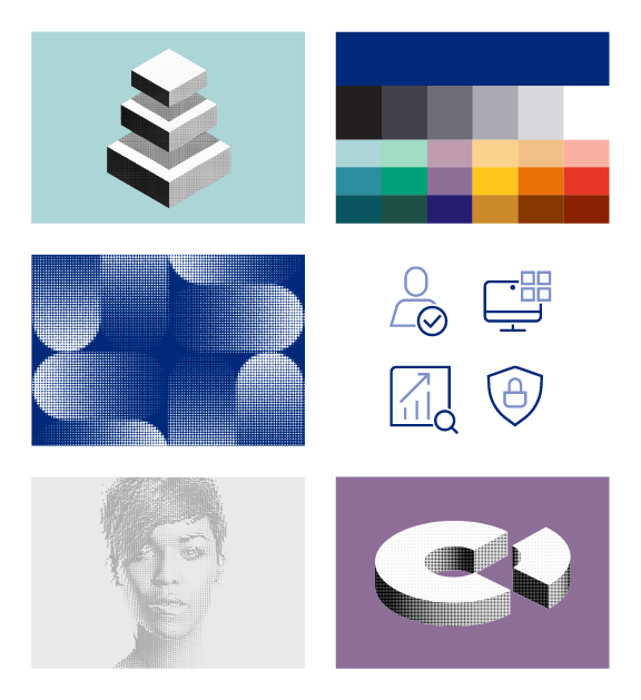
Identity and access management service Okta today launched its new design system, both for its own corporate and brand use, but also as an open-source project under the Apache 2.0 license. The Odyssey Design System, as the company calls it, is similar to the likes of Google’s Material Design or Microsoft’s Fluent Design. It may not have quite the same number of features, but what makes it stand out is a focus on accessibility, with every element of the design system being compliant with the W3’s Web Content Accessibility Guidelines.
Brian Hansen, Okta’s SVP of Design, told me that until now, the company didn’t really have a unified design system. Instead, it had what he called a “glorified pattern library.” And while the engineers loved it, because it allowed them to build new UIs quickly, it was hard for the team to add new patterns. “And so it was limited in what it could do,” Hansen said. “And what you ended up having to do sometimes is compromise — particularly as a designer — and kind of shove the square peg into the round hole.”
Now that Okta has moved beyond its early startup roots, though, the team decided that it was time to go back to the drawing board and build a more fully-featured design system for the company — and you may soon see it yourself in Okta’s sign-in widget, which is where most users are likely to encounter it. But it’s worth remembering that Okta, the platform, also offers a plethora of backend tools for admins that most users never see. Those admins typically want a very information-dense user experience and a design that makes it easy for them to get things done and move on. Okta’s third group of users, Hansen stressed, is developers and what matters a lot to them — in addition to all the technical details — is documentation, which has to be easily readable (from a design perspective).
As Hansen noted, though, internally, it wasn’t a realistic project to simply switch every surface area to Odyssee at once. “As a designer, you want everything to be perfect all at once. But you also have to be pragmatic and live with some things that aren’t perfect,” he acknowledged. So while the Okta brand is now getting this refresh and some of the user-facing services, it’ll take a while before every Okta service can make this move.
For the admin console, for example, Hansen’s team decided that it would take years to switch out the UI. So instead, the team opted for a bridge strategy where it created the style sheets to essentially mimic the Odyssee design. “Then we can cut over to Odyssee-native components and they’ll blend in. We can’t have a Franken app — we can’t have two different generations of UI coexisting. That to me just ruins trust. No one would be happy with that,” Hansen said.
Developers who want to give Odyssee a try for their own projects can do so and explore the different components it has to offer. And designers can try it out in Figma, too.


